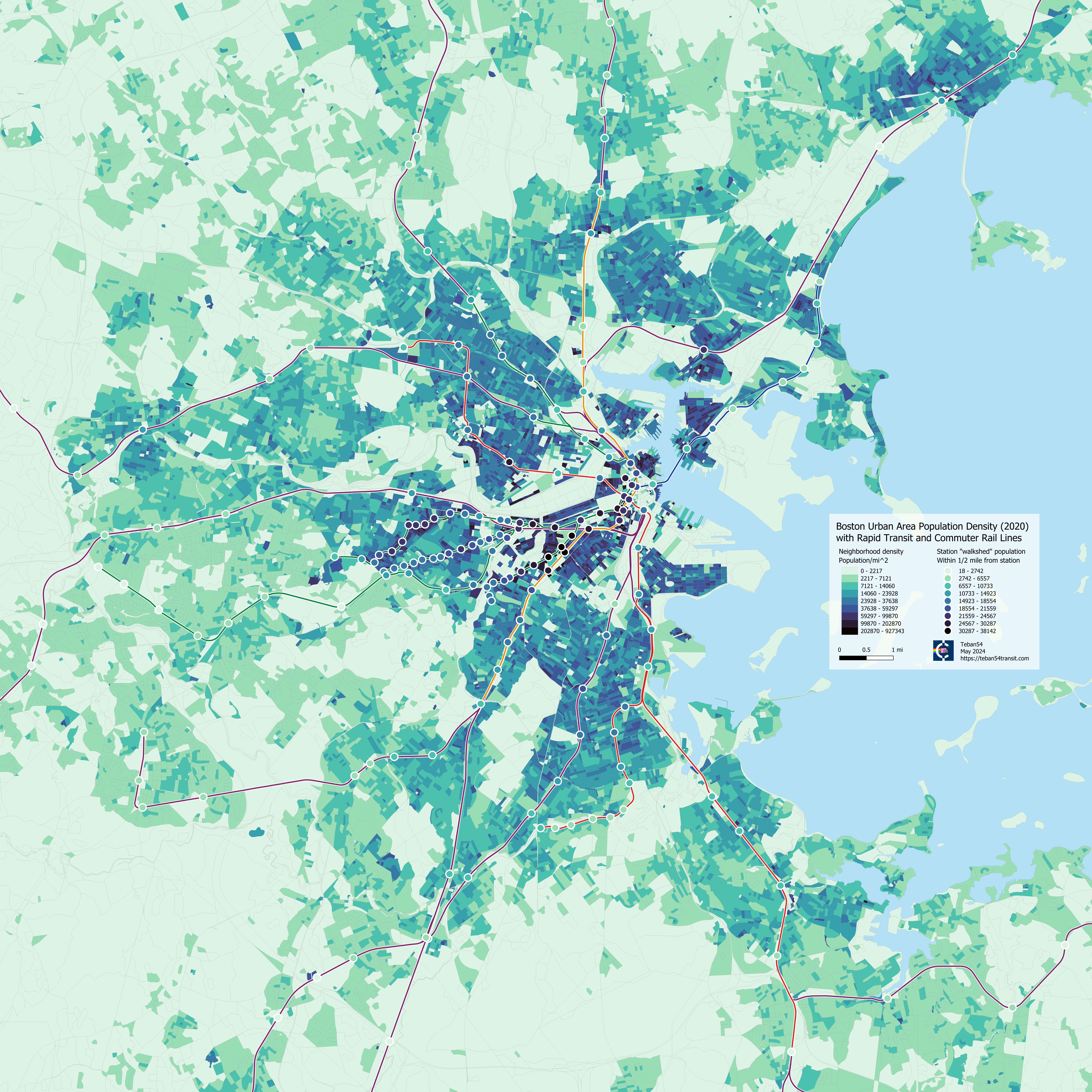
Population density plays a crucial role in any kind of transit planning, from amateur to professional. In most cases, there is a general consensus that neighborhoods and routes serving a greater population deserve higher qualities of transit.
Yet, data and visualizations of Greater Boston’s population seem surprisingly hard to find. Existing population density maps and interactive tools are either not well-designed for high-density urban areas (such as the official US Census viewer and this ArcGIS map made by Jim Herries (UOdocent)), or use the 2010 census which is now 15 years old (such as this static map from Bostonography). Not to mention none of them have an emphasis on transit.
So… I made one such map myself.
Density in Greater Boston (495-ish)
This map shows population density in the area roughly within the I-495 ring, going as far as Beverly, Concord, Framingham, Franklin and Brockton, overlaid with all MBTA rapid transit and commuter rail lines.
(High-res map expands on click)

Data sources: US Census 2020, MassGIS data for rapid transit and trains. (Note that South Coast Rail Phase 2 is shown due to limitations with the MassGIS data.)
Density in Boston Urban Areas (128), and Approximate Walkshed Populations
This second map below zooms in to the area roughly bounded by the I-95 ring (also known as Route 128), extending to Lynn, Melrose, Waltham, Readville and Braintree. This region is what people often consider as the “urban” area of Greater Boston, and it also largely corresponds to the boundaries of MBTA rapid transit today (as well as frequently discussed extensions, such as Blue Line extension to Lynn).
In addition to transit lines, this map also shows all rapid transit and commuter rail stations, colored by populations in their approximate “walkshed”. For this purpose, the “walkshed” is defined as anywhere within 1/2 mile (technically 800m in the code) from the station in straight-line distance. This is roughly a 10-15 min walk.
(High-res map expands on click)

Station walkshed populations are calculated by summing over the population within a circle with radius 800m centered at the station. As the data is organized in census blocks, in the event that a block is partially within the circle, its population is then multiplied by the fraction of its area in the circle.
Note that the color scale for stations is independent of the color scale for density, so their values may not match precisely.
Edit: I just realized that Chelsea commuter rail station was placed at its old location prior to November 2021, instead of the current one at Market Basket. This is again due to outdated data from MassGIS (even though the page claims it was updated in Nov 2023).
Station Walkshed Populations, in Tabular Form
If you want more fine-grained data of walkshed populations for each station, here are tables for all rapid transit and commuter rail stations.
Due to limitations of the data, residents in Rhode Island are not counted. South Attleboro’s population count only includes those in Massachusetts.
Caveats
If you want to sketch your crayon map of fantasy transit lines, a few factors may stop you from using the density maps at face value. They do not invalidate the usefulness of this data, but they are worth keeping in mind.
- Station walksheds are assumed to be perfect circles, without any consideration of the street grid, pedestrian-friendliness of the station, and other physical barriers. For example, the “walkshed” of Blandford St station on the Green Line B branch includes several dormitories on MIT campus across Charles River, as well as most of the Fenway neighborhood:

- Each station’s walkshed disregards other stations, and thus may include regions where residents may prefer other stations. For example, Cleveland Circle’s “walkshed” covers many dense blocks that are actually on the B branch, as well as blocks that prefer other stops on the C branch further inbound. Symphony’s “walkshed” includes houses that are closer to Hynes Convention Center or Massachusetts Ave (Orange Line). (This issue will be “addressed” in an upcoming blogpost – stay tuned!)

- These maps only consider people that walk to a rapid transit station, ignoring those who get there by bus or bike. While 56% of rapid transit riders outside of downtown stations do access them on foot or by bike, half as many (29%) use a bus connection. That’s still significant, and these buses can extend the outreach of any rapid transit line substantially. (Northside Orange Line is the most extreme example.)
- The density maps focus on residential areas by definition. They do not consider employment centers, cultural centers, and other destinations that may be even better at drawing demand for transit.
- Some of the densest blocks in Boston are residential halls of various universities (BU, Harvard, MIT, Northeastern, BC, etc). Buildings that are full of students, especially undergraduate students, may have fundamentally different transit needs from other demographics. Many off-campus apartments near these schools also have high proportions of (graduate) student population.
Any Thoughts?
In case you already have a lot of questions in your head — so am I! I already have a few ideas for “extensions” of this post in mind, and the most immediate one I will analyze next is the population served by each rapid transit “half-line”. This will be the topic of the next blogpost, and itself will hopefully lead to a further discussion of “Should the Green Line be converted to heavy rail?” (Which motivated me to make this map in the first place.)
Meanwhile, feel free to give any suggestions or requests! For example, are you interested in comparing populations of various neighborhoods? Or visualizing other census data (e.g. employment, demographics, commuting characteristics)? Just let me know by either commenting under this post, or reaching out to me on archBoston or Reddit!

Leave a Reply